matgilbert.com
Website Relaunch
⋅2 min read

Today my new website is live.
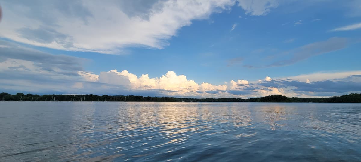
It feels kind of like the photo above.
It doesn't look grand, there isn't a huge amount of stuff to it yet but it's all the things I need.
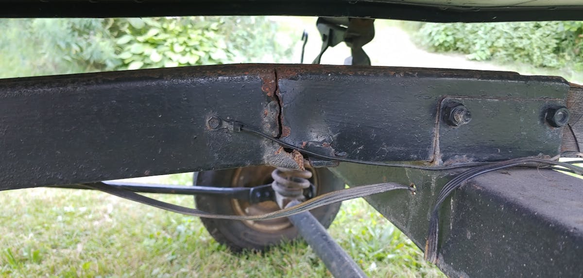
The river isn't ok, but at least it's flowing and that means it's time to get to work.
It's a next.js template I bought, trimmed and styled to my liking pepperd with some personal photos.
It's "craigslist ugly" as some might say but I'm calling it minimalism with a purpose: "Telling a story".
The UI is here to do one thing, get you to the content I told you about. Whether it's chatting with me at a bar or giving a talk at some sort of conference, I want to make sure that when I tell people to "check it out on my website" the process is as easy as can be.
This means no extra crap to get in the way. No unnecessary design, and the only trappings of social media share stuff are just extras from my pre-made template that I choose to leave because realistically, I'm shooting myself in the foot by removing them.
As long as its aesthetically pleasing and clean, for me that's the real test.
My new website is live and I'm excited at the possibilities.


